


The Story of a Boy, a Girl, and a Universally Celebrated Poster Design

Old fashioned illustration formed the visual language of the Original Trilogy’s theatrical posters and it would be difficult to argue that any campaign artwork eclipses the iconic stature of Tom Jung’s Star Wars “Style A.”
Style A Theatrical One Sheet - Source: StarWars.com
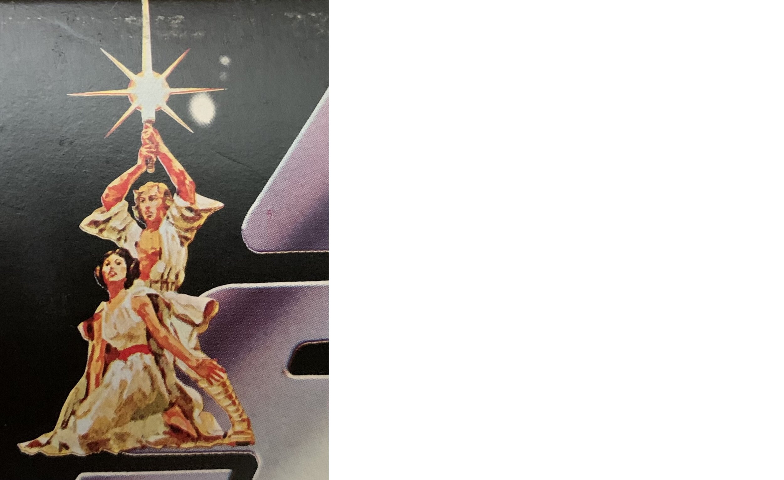
Broadly recognized and replicated around the world, its focal point of a hyperbolically romanticized rendition of Luke Skywalker and Princess Leia heightens the fantasy element of Star Wars several notches above every poster in the franchise that followed.
I was first introduced to the image on a CBS-Fox Video VHS cover in the late 80s, and maybe it was initially growing up with the film on the small screen that led to my adolescent perception, “Isn’t this a little much?” Seeing the film on the big screen with a rambunctious crowd certainly recalibrated my understanding of the Style A’s larger than life look – this movie is huge…it’s epic. Despite the incongruity between Luke and Leia’s likenesses compared to their onscreen portrayals, the poster somehow eludes the charge of false advertising that Hollywood genre films are historically guilty of.
Perhaps it works so well because of its “loudness,” speaking up for a movie whose magnitude caught audiences off guard in the early days of its release. Given the uncertainty that the Style A one sheet was even available for the film’s May 25th opening and may not have materialized in theaters until later in the summer, the poster’s extroverted zeal could be seen (figuratively) as a confident affirmation to the moviegoing public that Star Wars was indeed spectacular.
Symbolic interpretations aside, the reality of the Style A one sheet’s apparently delayed debut and the evolution of the campaign’s design as a marketing apparatus are the primary target of this piece. A fascinating StarWars.com article highlighting “7 Things You Didn’t Know About the Original Star Wars Poster” paired with an unusual Rolling Stone print ad in my collection sparked curiosity to dig a bit deeper and attempt to trace the development of Luke and Leia’s classic triangular pose.
Its originally produced form is a logical place to begin, namely the artwork for the half sheet poster and souvenir program.
Style A Theatrical Half Sheet - Source: SyFy Wire
Jung had finished the horizontal half sheet artwork prior to that for the vertical one sheet, though it ended up being printed in poster form later. Both would feature a parallel Luke & Leia pose, with the hero’s lightsaber “cross” motif originating in the half sheet and incorporated with further embellishment into the one sheet.
Star Wars Souvenir Program (1st Printing)
The souvenir program cover utilizes a slightly earlier version of Jung’s design with R2-D2 and C-3PO conspicuously absent. After the Hildebrandts’ expeditiously created and commercially popular take on the Style A included the droids, they were subsequently added to both Jung posters by another artist.
Above is the aforementioned full page ad from the June 2nd, 1977 edition of Rolling Stone which exhibits several oddities signifying the movie’s marketing scramble. On top of the scrapped “An odyssey to the edge of your imagination and beyond, far beyond” tagline and the rarely seen hybrid “pointy W” / space crawl logo, the art is an iteration that predates Jung’s droidless half sheet design.
There are minor variances throughout, but the most glaring anomaly is the rendering of Princess Leia. Specifically, this seems to be the last published depiction to retain a strong Frank Frazetta flavor, offering a glimpse at what came before requested revisions to more accurately represent Carrie Fisher’s likeness and onscreen costume.
The renowned fantasy artist had a direct influence on Jung’s initial characterizations of Luke and Leia, and logically so with Jung having considered that Frazetta himself might execute the final poster artwork. To see one of these precursory designs actually make it to print at the time of the movie’s release is intriguing on multiple levels, but being a concept art enthusiast, it’s the drastic deviation in Leia’s appearance (particularly in light of Luke’s remaining fundamentally the same) which presents the type of puzzle I’m always keen to see pieced together.
Luckily, a tangible trail of the Style A’s maturation has surfaced with several Tom Jung illustrations listed at auction and elsewhere online over the past several years. Each demonstrate characteristics from the one sheet and half sheet layouts converging throughout the design process.
Source: Bonhams - December 2019
These rough sketches from a late 2019 Bonhams listing represent some preliminary play with the Luke & Leia pose with a hint at how the pair might interact with the film’s logo. While Leia’s flowing locks would resurface in other stages of the design, the casual sitting position seen here gave way to the familiar stronger and markedly sultry pose.
Source: Profiles in History - June 2017
The concept sketch above carries over Leia’s “hair down” hairstyle and aligns with the one sheet’s eventual composition. In contrast, Luke’s likeness in the alternate composition below resembles the “Hamill-accurate” representation in the released poster and Leia’s “space bun” hairdo is present.
Source: Profiles in History - June 2017
Toggling over to half sheet illustrations, certain stylizations emerge while others blend together.
Source: Profiles in History - June 2017
This sketch above from a 2017 Profiles in History listing consists of the half sheet’s primary ingredients, with a somewhat different “hair up” style for Leia that is outlined with greater precision in the rougher sketch below from a 2019 Bonhams auction.
Source: Bonhams - December 2019
Source: Bonhams - December 2019
A further developed drawing on the reverse side, however, displays Leia’s traditional hair buns. Luke is also getting close to his half sheet look here.
The following half sheet drawing listed by Heritage Auctions in late 2017 exhibits refined detail, generally capturing the nature of the finished color illustration with some components remaining a bit fuzzy.
Note the lack of the Vader style boots for Luke as well as Leia’s ill-defined hair.
Sotheby’s listed the one sheet concept below that was done with similar technique but strays from the other illustrations in many ways, most noticeably in Luke’s attire and choice of weapon.
Source: Sotheby’s - 2019
The darkly clad, gun-totting protagonist drawn in this piece appears to have been inspired in part by publicity stills of Mark Hamill (sans Luke’s golden Yavin IV jacket). Since we’re on the subject of ceremonial costumes, this is a good time to note that Leia’s clothing in all of the Style A illustrations and final art mirrors her gown from the film’s ending instead of her principal outfit.
Source: RPF Forums
Source: Cosmosonic (Tumblr)
With the fully exposed belt, lower neckline, and flowing capelet all present in some form, Jung increasingly amplified – or “Frazetta’d,” if you will – Leia’s glamourous second costume as the campaign’s concept artwork progressed.
Source: Mirror Maelstrom (Tumblr)
A pinnacle was reached with the illustration above, which couldn’t be any more Frazetta without entering R-rated territory. Leia’s long, windswept hair from exploratory sketches also reappears.
Source: PFHarlock (Reddit)
The “peak Frazetta” Style A design was applied in an ad concept with promotional copy that equals the art’s absurd sci-fi melodrama:
“…one man will have an epic adventure greater than any man has ever had before and greater than any man will ever have again. STAR WARS.”
I have a propensity to use the word “man” a lot in casual conversation, but oh man, that is a lot of mans. Of the many outlandish slogans being proposed and tested, this may be one of the lamest and least Star Wars-y. The studio’s basic understanding of the film was being called into question rather than “the ancient virtues of love and freedom and heroism.”
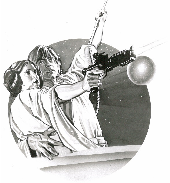
As the movie’s marketing identity struggle raged on, Jung took things down a notch with the one sheet illustration below. Like the previous image, Luke’s boots are generic and less Vader-like, but his visage otherwise essentially matches that from the produced half sheet.
Source: Profiles in History (Twitter)
Leia, on the other hand, has a marginally concealing dress and once again dons a “hair up” variation comparable to some preceding sketches. Now we’ve sort of come full circle, visually placing the distinct artwork printed in the Rolling Stone ad on a rough path toward the two distributed posters, particularly in the context of the half sheet painting being completed ahead of the one sheet’s.
Half Sheet Concept (Rolling Stone)
Half Sheet Final
One Sheet Concept
One Sheet Final
Now to delve into examples of Jung’s Style A designs and other incarnations of Luke & Leia as expressed in press material and theater ads from the film’s original run.
As mentioned in this essential article on pre-release collectibles, the film’s pressbook pictured advertising accessories in both Jung’s and the Hildebrandts’ versions of the Style A. Like many items contained in catalogs and publicity kits, the final products differed from the proxies seen in the pressbook.
The Hildebrandt design would be replaced with Jung’s for the one sheet, and the uncommon “pointy W” / space crawl logo seen in the June 2nd Rolling Stone ad is present on the mock-up images for the Jung-based insert and half sheet. It’s clear the hybrid logo was hand cut and applied for the insert, as was the famous (and much improved) tagline, “A long time ago in a galaxy far, far away…” on the half sheet mock-up.
The theater ad below from the movie’s May 25th opening in Sacramento is interesting in that it uses the semi-final half sheet artwork (missing the droids) and the odd hybrid logo akin to the mocked-up half sheet from the pressbook.
One of only seven California theaters where Star Wars debuted on 5-25-77, the Century 25 at Arden and Ethan Way hosted one of the longest engagements in the country at an impressive 60 weeks.
Though the Hildebrandts’ Style A art was employed for many print ads in the first phases of release, Jung’s one sheet design began to show up in theater listings as the Summer of ‘77 rolled on, just as the poster did. The above ad ran in September when Star Wars graced the screens of two Oklahoma City area theaters. Arriving first in mid June at the North Park Cinema 4 for what ended up being a 21 week run, the West Park Twin in nearby Warr Acres went on to show the movie for 27 weeks. As discussed in the “7 Things You Didn’t Know” article that started me down this rabbit hole, you’ll notice that Leia’s exposed left leg from the one sheet poster is covered up in the print ad.
Internationally, some countries blended traits from the Jung and Hildebrant designs to create something new.
Danish One Sheet - Source: Imgur
In Denmark, Jung’s human and droid quartet were simply embedded within the Hildebrandts’ brightly realized background, with Luke’s lightsaber maintaining the brothers’ starburst effect over Jung’s cross.
Japanese artist Seito adapted the Style A for one of the country’s one sheets (pictured at left in miniature Chirashi form), creating a Jung-adjacent but wholly unique translation of Luke & Leia.
In closing, this post is by no means intended to be a definitive chronology, but a graphic exploration of Tom Jung’s fluid artistic approach that resulted in the universally celebrated Style A campaign and its various derivatives. Jung was ultimately able to strike the perfect balance, outwardly projecting and stylistically intensifying the inner power of attractive but down to earth, relatable characters.
_______
As a coda, it’s an opportune moment to highlight a few fun commercial products that made use of the Style A’s courageous leading characters. How many items were branded with the pair in your young life?
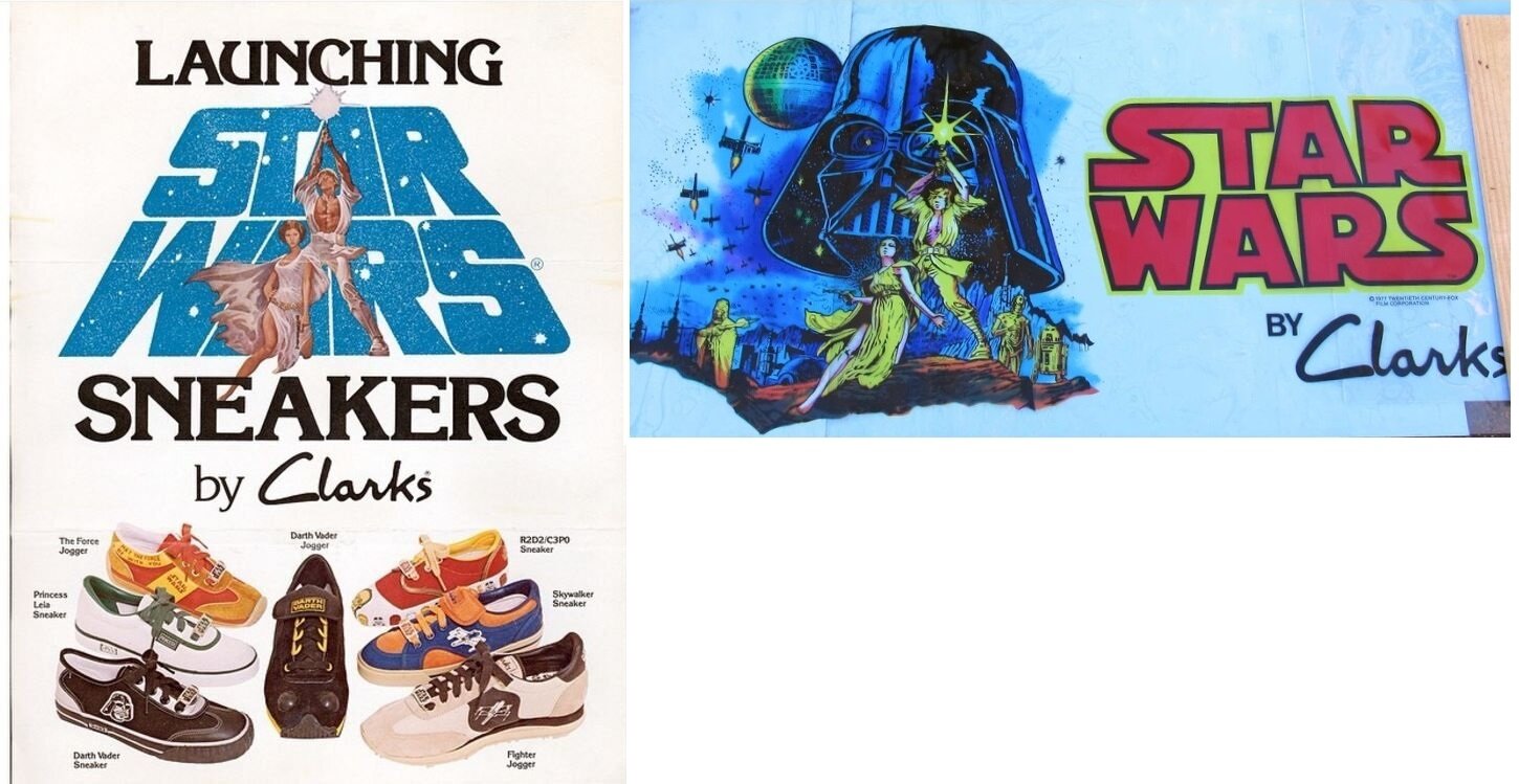
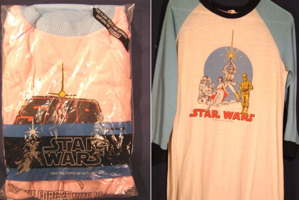
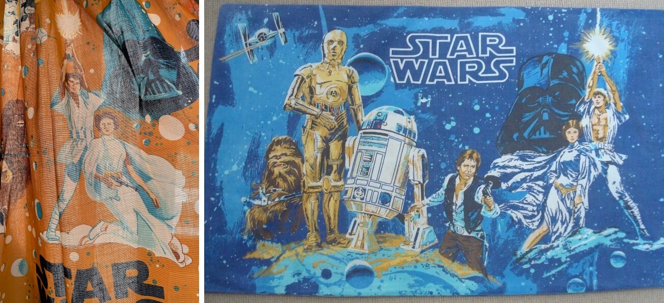
Needless to say, the image of the boy, the girl, and their universe was ubiquitous when it came to Star Wars and critical to it becoming “more than a movie.”
If your eagle eyes detect any other patterns or peculiarities throughout this blog post, please leave a comment!