The Rebellion's Longest Day: ROGUE ONE's War Film Advertising Campaign
While Rogue One may lack the slick, solidly manufactured structure that gives The Force Awakens a stronger identity and narrative cohesion (it was the first Star Wars film to receive an Academy Award nomination for Film Editing since, well...Star Wars), the first standalone entry to the franchise deserves credit for taking more risks. Stripped to its core and appreciated without its undeniable elements of fandom pandering, Rogue One reaches its peak whenever it most closely captures what was evoked in its decidedly bold print advertising campaign: wartime conflict.
The film's intended tone was set from the very early stages of its marketing life with a striking conceptual painting that immediately broadcast that this was to be a "war picture" through and through. I was instantly intrigued. Much like scores of Ralph McQuarrie's paintings from the Original Trilogy, this singular image told a story that one could immerse themselves in and promised the realism that made the intergalactic warfare in those early films as believable as it was (Ewok slingshots aside).
Source: Wookieepedia
Rogue One's cinematic DNA is well documented as being comprised of strands from a multitude of classic combat films, with the filmmakers citing such titles as The Guns of Navarone (1961), The Dirty Dozen (1967), Apocalypse Now (1979), and Saving Private Ryan (1998) as primary influences from that genre, among several others. Its ability to creatively amalgamate and repackage while bringing something new to the saga's tapestry – like any Star Wars movie at its best – is where it excels. From the tense Homeland-esque Jedha sequences with Jyn (Carrie) and Cassian (Quinn) caught in the crossfire between Rebel extremists and Imperial oppressors to the carnage in paradise in the final act on the beaches of Scarif, Rogue One presents an entirely new meaning to Luke Skywalker's surprised and naive remark, "You know of the Rebellion against the Empire?!" Moral ambiguity, internal struggle, and a sense of true loss were embedded within the Rebellion's makeup for the first time, and the fact that the onscreen combatants were tangible, predominantly human beings imbued authenticity unlike any previous Star Wars film.
Stepping outside of the movie itself, I found it interesting to compare standout examples from Rogue One's range of promotional imagery to those of some of its war film ancestors. Some similarities are more apparent than others, but I hope you'll indulge me as I really enjoy these visual exercises.
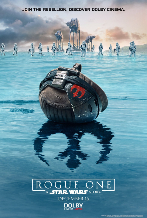
In particular, this poster exclusive to moviegoers that attended Dolby Cinema screenings provides a number of visual connections to war film posters of the past.
Source: Jedi News/Dolby Cinema
Easily my favorite poster artwork for the film, this image initially appeared in a Russian incarnation of the poster and and many may have noticed an obvious parallel to the opening and closing shot of the D-Day epic The Longest Day (1962).
THE LONGEST DAY (1962)
The infantryman's helmet has long been a self-evident symbol in historical war propaganda and war film advertising. Strikingly utilizing it in a Star Wars movie poster was a solid move in terms of making a clear statement that audiences should expect something different.
ALL QUIET ON THE WESTERN FRONT (1930) Source: Cinyus
PLATOON (1986) | Source: Film On Paper
The helmet motif was also cleverly applied in artist Orlando Arocena's re-imagining of the subversive one sheet for Kubrick's Full Metal Jacket (1987). Be sure to check out several others in the series here.
FULL METAL JACKET (1987) | Source: IMP Awards
Source: Orlando Arocena - Behance
Rogue One's "Fallen Commando" Dolby poster also reminds me a lot of this bleak poster for Sam Peckinpah's Cross of Iron (1977), with the Rebel insignia and tranquil shores of Scarif replacing the German Iron Cross and barren Eastern Front of World War II.
CROSS OF IRON (1977) | Source: IMP Awards
One of the film's IMAX posters is almost like a subdued version of a one sheet for The Dirty Dozen. Dissimilar to previous Star Wars posters, these IMAX posters incorporate significant white space like many action movie posters of old. I would have loved to see Rogue One's ensemble of heroes represented with a little more attitude (...THEN TURN THE LOOSE ON THE EMPIRE!), even if it wouldn't exactly correlate with the characters onscreen. But when did that ever stop poster design from being a little over the top?
THE DIRTY DOZEN (1967) | Source: IMP Awards
Source: IMAX.com
The defining element of Rogue One's advertising campaign is the prevalence of the finale's picturesque island setting. Dueling billboards pitting our team of Rebel protagonists against a squad of Stormtroopers on an idyllic tropical beach appeared in cities around the world, offering an undeniably eye-catching pitch. You can see some of these in action in Los Angeles over at the wonderful Daily Billboard blog.
Source: Milners Blog
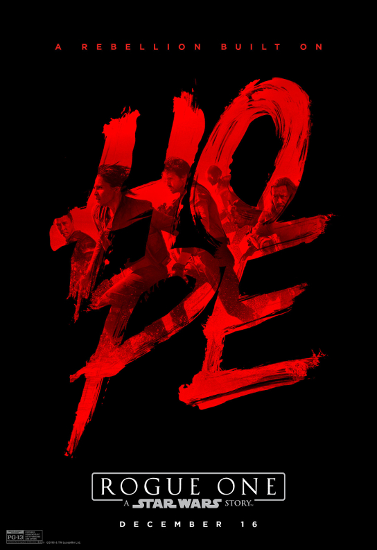
An exclusive poster available at early screenings at the El Capitan Theatre in Hollywood combined the imagery of the film's heroes with its (arguably overstated) theme and slogan in a style that diverges from Star Wars poster norms more than any other. Though it may not fit the tastes of some fans, I personally admire it for its distinctive edginess.
Source: Los Angeles Times
Bringing things back to The Longest Day, the El Capitan "Hope" poster and its source image are also reminiscent of a poster for the World War II film, with the Allied Forces charging the beaches of Normandy in red and black.
THE LONGEST DAY (1962) | Source: Hollywoodland
Rogue One delivered on its advertising campaign's assurances enough for me to eventually get past its storytelling shortcomings. I've felt fully engrossed in its world with each viewing, and will never see the original Star Wars the same way, mostly for the better. Unfortunately, the film's final moments satisfy broader fandom desires that in my mind diminish the weight of the band of heroes' ultimate sacrifice. It was their story; it was their longest day. I know it would have been too much to ask for a Star Wars movie to end dwelling on that with some empty silence on the shores of Scarif, but I'll always try to think of this film that way.
